Redesigning the card experience for clarity, discoverability and scale
PicPay Card wasn't just suffering from bad UX. It was an app within an app, and no visual polish would fix that without addressing the underlying architecture.
Project
PicPay | Card
Role
Product Designer UX Researcher
Year
2023
+38%
discoverability of top card actions
−28%
navigation time to key features
−40%
steps across the core card journey
Overview
PicPay Card competes for visibility inside one of Brazil's largest financial ecosystems. While it was a strategic product, the experience suffered from duplicated navigation paths, inconsistent hierarchy, and features buried under layers users never reached.
Cards wasn't just suffering from bad UX. It was an app within an app, and no visual polish would fix that without addressing the underlying architecture.
1One flat level. The card hub fanned out into seven destinations with no grouping or hierarchy.
2Two doors, one room. "Settings" and "More options" were duplicate entries opening the exact same menu.
SettingsMore options
both open the same sub-menu
3…that buried everything. The sub-menu repeated items already shown above and hid the most-used actions among junk.
My dataVirtual card repeatedChange passwordCard due dateAdjust limit repeatedTemporary blockAuto debitUnlock card
Discovery
Analytics showed that the most accessed features (invoices, card limit, virtual card) were buried under navigation layers that forced users to scroll and guess. The usage curve dropped off sharply past the first screen.
User interviews confirmed: people were navigating by memory, not by design. Features were placed based on what had been built last, not what users needed most.
4.6×more entries into the flat card hub than into the deep settings menu over a single month — yet the most-needed actions lived in the menu almost no one reached.
Card hub512,615 entries
All invoices124,110
Settings duplicate entry86,851
Adjust limit duplicated52,594
More options duplicate entry23,420
Virtual card duplicated20,646
Help center7,794
Refer friends3,180
Settings menu110,271 entries
My virtual card duplicated12,728
My data12,728
Adjust limit duplicated10,128
Auto debit8,587
Temporary block6,331
Unblock card2,485
Change password2,025
Card due date1,715
The framework: Enabler, Core, Discover
Rather than reorganizing screens one by one, a structural hierarchy was defined to guide every layout decision. Enabler, orientation layer at the top. Core, primary actions users consistently needed. Discover, future-ready space at the bottom.
9:41
Enabler
Core
Discover
Below the fold
Enabler
++ Visibility−− Interactivity
Top of the screen, always seen, rarely tapped. Pure orientation.
Core
++ Visibility+ Interactivity
The reachable middle, seen and acted on. The primary actions live here.
Discover
− Visibility++ Interactivity / Scrolling
Lower and scrollable, less seen, but where thumbs naturally roam.
Below the fold
−− Discoverability+++ Familiarity++/−− Interactivity (depends on side)
Reached only by scrolling, a familiar pattern, but easy to miss.
Each layer earns its place by how seen and how reachable it is, architecture driven by intent and ergonomics.
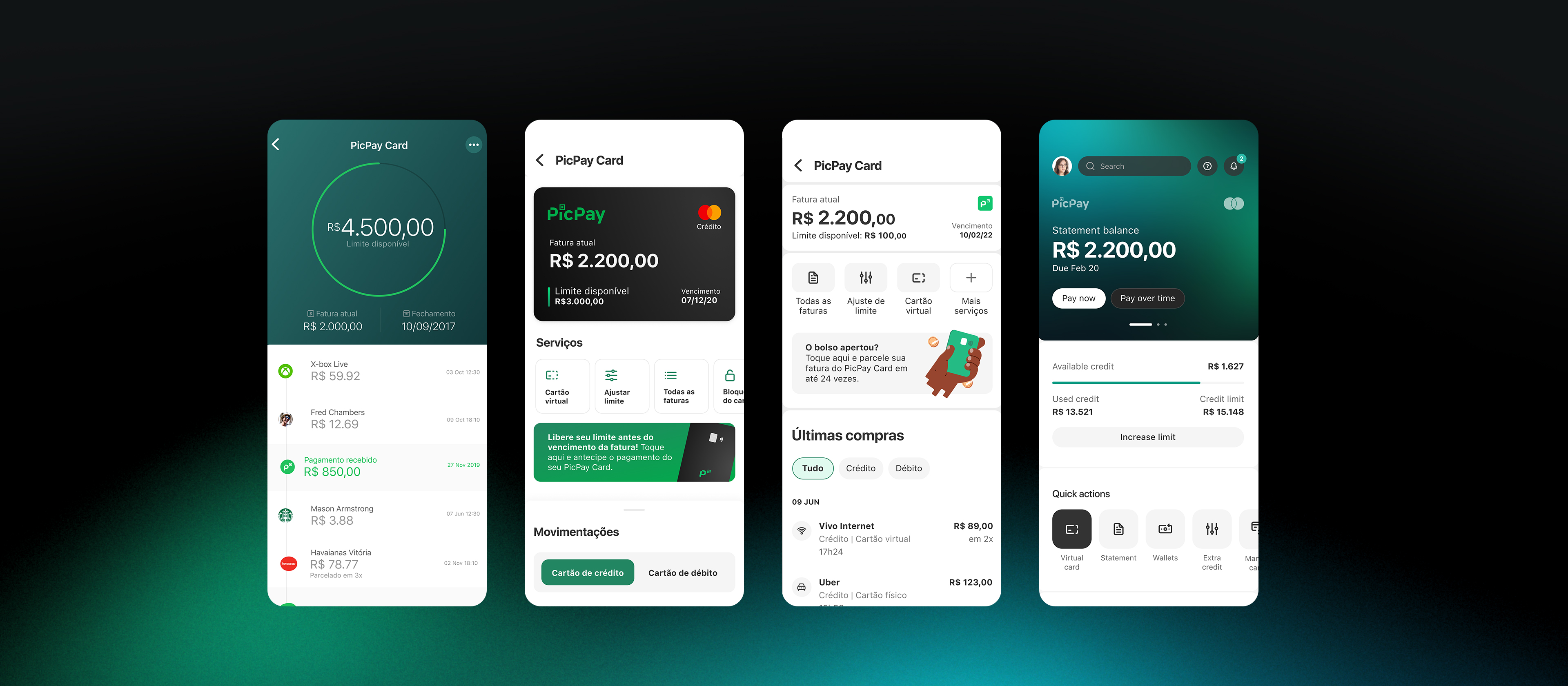
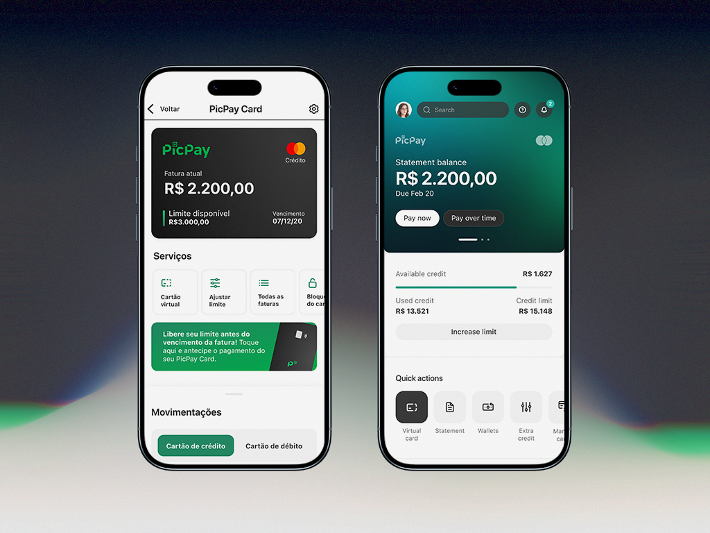
What changed and why
Card overview
Card, balance, and limit moved to a permanent orientation layer, what users need the moment they open the screen.
Primary actions
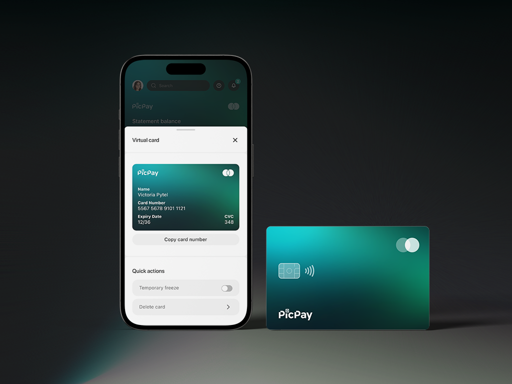
Invoices, card limit, virtual card, not what the product wanted to promote, but what users consistently needed. Surfaced directly.
Discover zone
Space for new features and lower-frequency actions, designed to absorb future squad contributions without disrupting hierarchy above.
Navigation consolidation
Duplicated paths removed. One way in, one way out, reducing cognitive load and eliminating the "navigate by memory" problem.
Impact
+38%
Discoverability of top-used card actions, virtual card, limit, invoices
−28%
Navigation time to reach the most accessed features
−40%
Fewer steps across the core card journey after removing duplicated paths
Scalable
New PicPay products and features can now be introduced into the experience without disrupting the established hierarchy
Final screens reimagined in 2026. The usage data reflects the original shipped version.